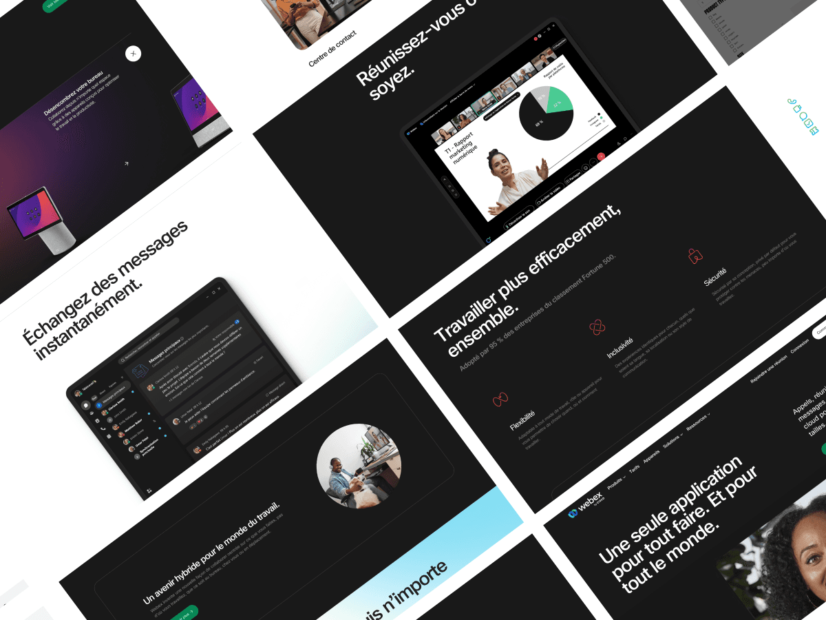
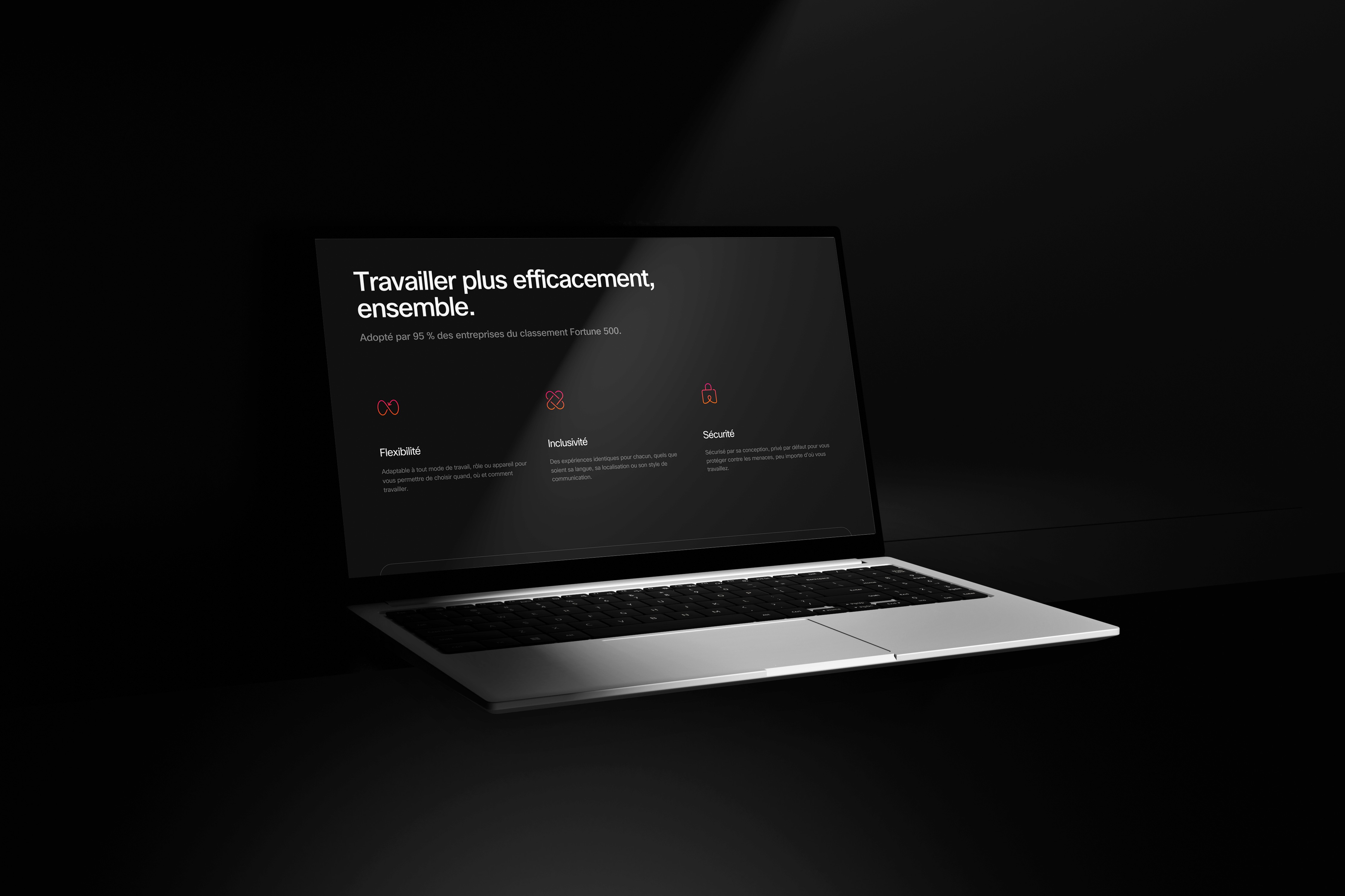
We structured the page as a system of reusable modules that scale with campaigns and releases. Core sections include: a focused hero with dual CTAs; feature pillars (call from anywhere, instant messaging, content sharing, inclusive meetings); a live integrations gallery; customer/social proof; and a “security by design” block highlighting privacy and compliance.
All modules share a consistent layout grid, typography, and gradient accents from the Webex brand. Content can be reordered or swapped for new launches, ensuring the French homepage stays fresh without redesign.
Explaining a broad platform to multiple audiences on one page.
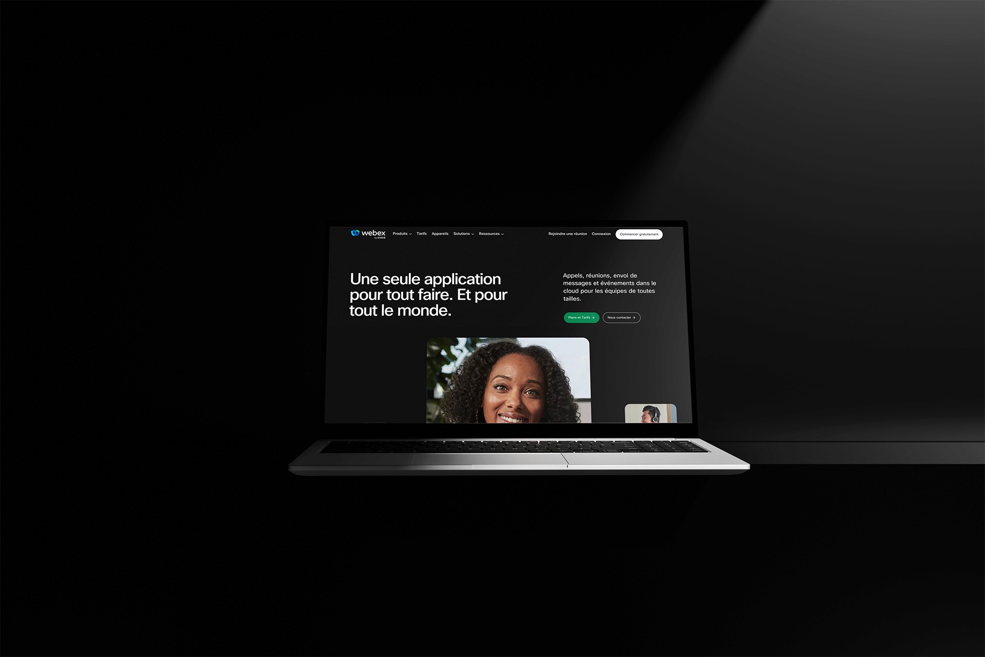
Webex spans many products and use cases, from 1:1 calls to enterprise-grade webinars. The challenge was to make the offering understandable at a glance, without overwhelming users, and to keep the experience fully localized for French audiences. We partnered closely with the Webex brand, product, and regional marketing teams to align messaging, terminology, and compliance while preserving the global identity.
To solve this, we combined crisp value propositions with proof and utility: concise copy blocks, feature storytelling, partner logos, and security assurances—so IT buyers get confidence and end users see immediate benefits. The result balances clarity, depth, and conversion.
The previous journey scattered key actions across multiple links. We mapped the primary intents—try Webex, talk to sales, or learn a specific product—and simplified the path with a sticky header, anchored CTAs, and progressive disclosure inside each module.
Microcopy and UI patterns were localized for French (tone, cadence, and form fields), and accessibility was prioritized (contrast, focus states, semantic structure). The result is a guided, distraction-free flow where users quickly understand what Webex offers and how to get started.